Is Japan unusually equal for its scale?
Adjusting for population helps Japan a little. Germany is why scale cannot explain the gap with Northern Europe.
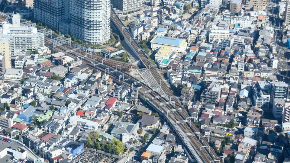
Photo by Manish Tulaskar on Unsplash · Unsplash License
One thing I find strange about Tokyo is how little it advertises class. A salaryman, a student, a service worker and a wealthy professional can ride the same train, eat on the same narrow commercial street, shop at the same convenience store and occupy the same safe public realm.
The problem is that the national numbers do not cooperate. Japan is not especially equal by the conventional after-tax income Gini. Nordic countries and several Central European countries also do better on broader measures of inequality. But Denmark has around six million people while Japan has roughly 124 million, one of the world’s largest metropolitan systems and an industrial economy spanning advanced manufacturing, logistics, finance and services.
I built the Equality at Scale Index to test one possible explanation: is maintaining equality simply harder at that size?
A scale adjustment
Dividing an equality score by population would guarantee that every large country loses. Instead, I estimated the Human Equality score we would expect from a country’s population, income and industrial complexity, then measured how far its actual score sits above or below that expectation.
EASI v1.0
50% Human Equality percentile
30% Shared Development percentile
20% Scale Overperformance percentile
Human Equality is 100 minus the UNDP coefficient of human inequality, which averages inequality in health, education and income. Shared Development is the percentile rank of the Inequality-adjusted Human Development Index. That keeps the index from rewarding a country for being equally deprived.
The scale model uses population and GNI per capita alongside an industrial-complexity score built from the dimensions in UNIDO’s industrial classification: manufacturing value added per capita, manufacturing employment intensity and medium/high-tech manufactured exports.
Scale helps Japan a little
Across the 169 countries with enough data to score, a doubling of population is associated with roughly half a Human Equality point less, holding income and industrial complexity constant. Japan is about 1.8 points more equal than the global model predicts.
Then I ran the comparison again using only the 44 high-income industrial economies. The population effect became small and statistically insignificant. Japan landed almost exactly where that peer model expected it to.
Germany is the problem for the easy version of my theory. It has more than 80 million people, a highly sophisticated manufacturing economy and a higher EASI score than Japan. Large industrial societies can sustain substantially higher measured equality.
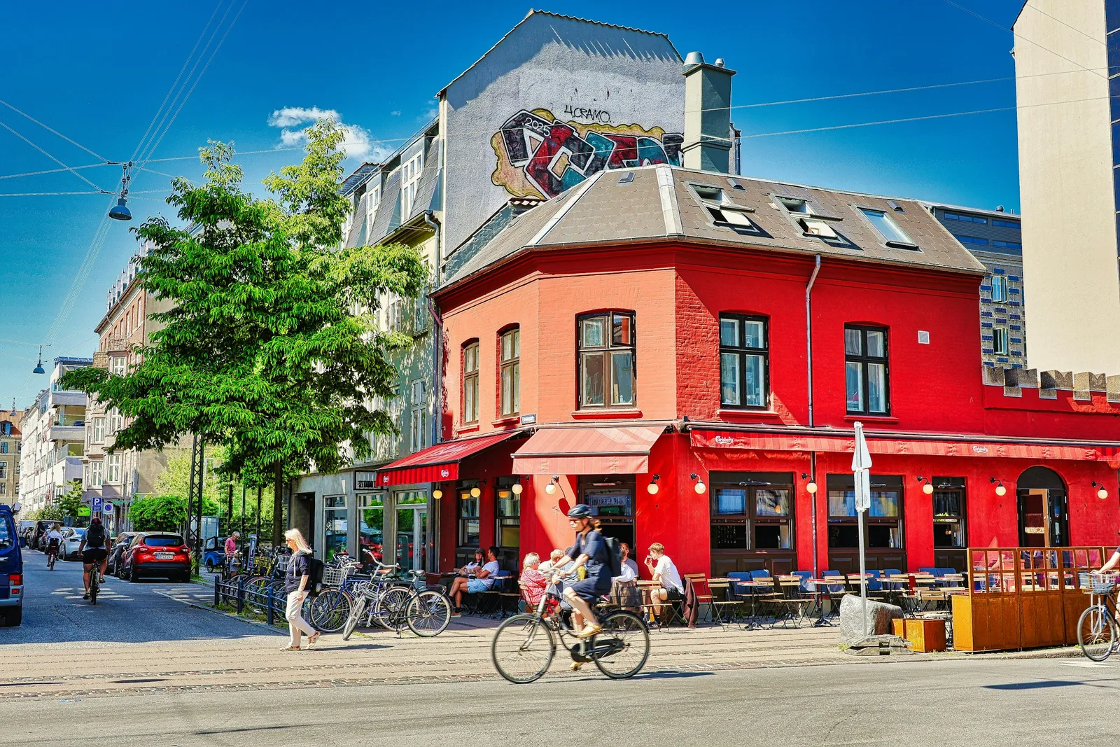
Photo by Alain Rouiller on Unsplash · Unsplash License
| Rank | Country | EASI |
|---|---|---|
| #1 | Slovenia | 92.3 |
| #2 | Czechia | 92.2 |
| #5 | Finland | 89.9 |
| #15 | Germany | 85.0 |
| #26 | Japan | 81.1 |
| #50 | United States | 68.5 |
What the national data miss
Income is only one input into a life. Location determines how many jobs, friends, restaurants, doctors, schools, parks and cultural spaces are within reach. Transit determines how much geography costs. Zoning and housing construction determine whether desirable locations are rationed by price.
Tokyo combines these systems unusually well. Dense population supports rail. Rail creates many centers instead of one scarce downtown. Housing supply can respond through permissive redevelopment. Small lots and tiny commercial spaces let businesses exist below the scale of a chain store. A huge amount of urban life remains accessible through the same public network.
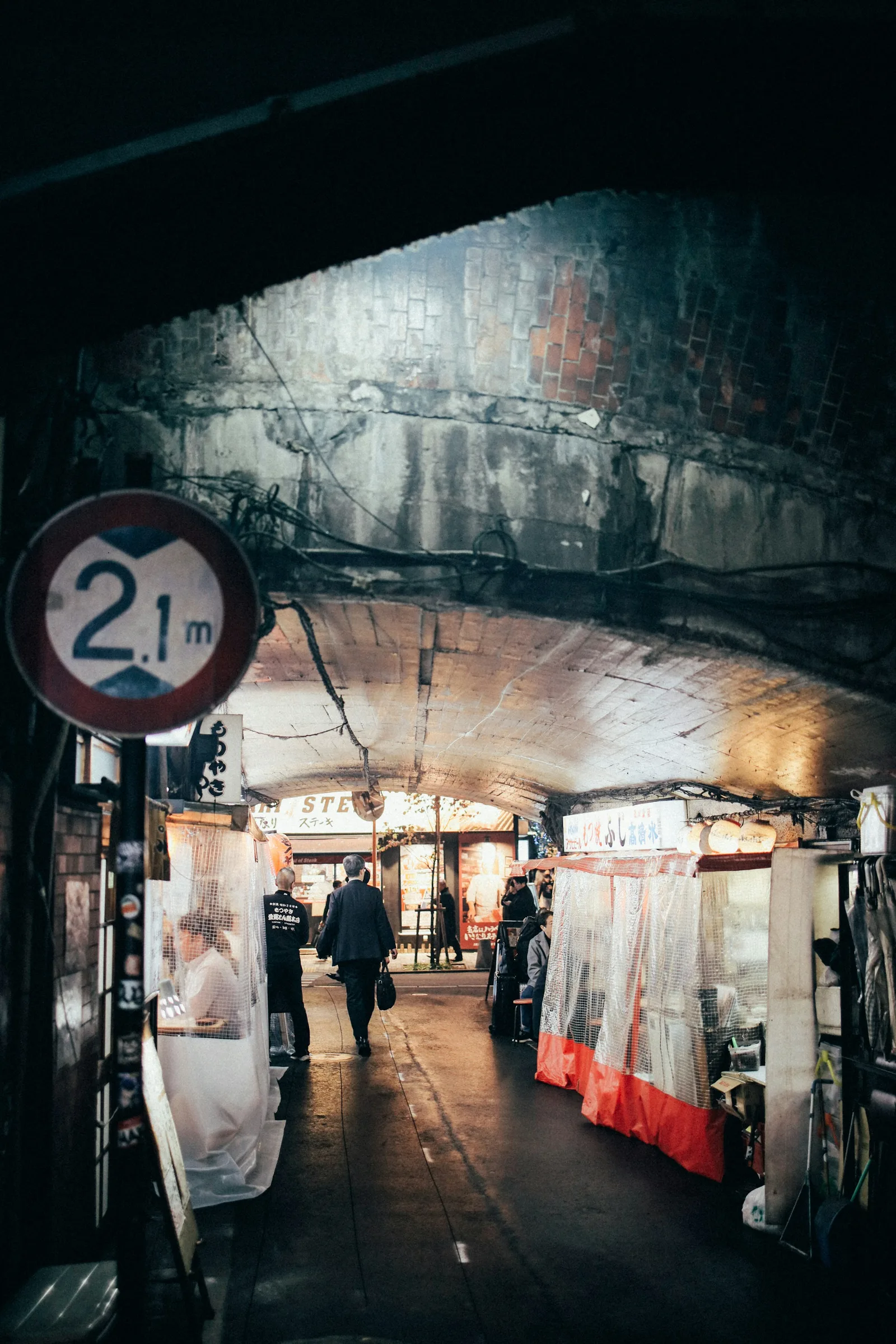
Photo by Tsuyoshi Kozu on Unsplash · Unsplash License
A country can compress differences in disposable income. A city can also compress differences in distance and access. EASI v1 measures the first kind much better than the second.
Urban β is not the answer yet
I made a beta index from the comparable data I could find: OECD public-transport access in midsize and large functional urban areas, plus housing security for the bottom income quintile.
EASI Urban β0.1
50% Base EASI
30% Transit access
20% Housing security
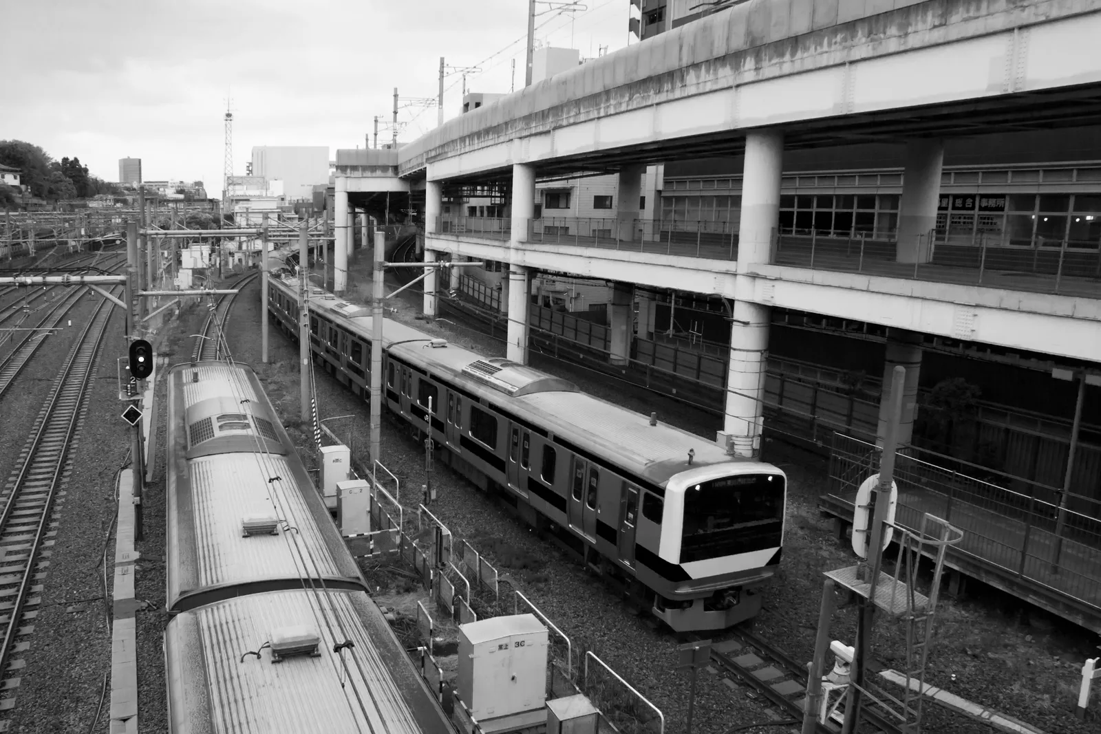
Photo by Muhammad Irfan on Unsplash · Unsplash License
Japan’s country-level transit figure contains only two functional urban areas, so I exclude it from the default robust ranking. More importantly, the available data do not capture the things that motivated this project: small-lot mixed use, housing-construction responsiveness, commercial amenity density, residential income mixing, car independence, or the number of opportunities reachable in 30 or 45 minutes.
The model supports one modest claim: population has a small relationship with equality globally, and accounting for it helps Japan, but not enough to explain the rich-country gap. It leaves the question I actually care about open: is Japan unusually good at distributing access to urban life? EASI Urban β does not have the data to settle that yet.
Sources
UNDP Human Development Report data — HDI, IHDI and inequality measures.
UNIDO Statistics — industrial structure and classification inputs.
OECD Regions and Cities at a Glance 2024 — transit-access data used in Urban β.
OECD Affordable Housing Database — housing-cost overburden data used in Urban β.
Comments