Yahoo Japan looks outdated. It may be the better homepage.
A mobile comparison of Yahoo Japan and Yahoo US, and what the evidence actually says about information density, visual complexity, and putting useful things above the fold.
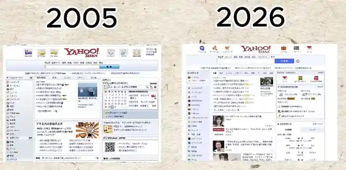
A short about Japanese web design made a familiar point: Yahoo Japan in 2026 still looks suspiciously like Yahoo Japan in 2005. The implication is that Japan’s web is stuck because large companies subcontract software work, fear failure, and keep old interfaces alive.
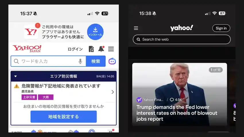
I opened Yahoo Japan and Yahoo US on my phone. The Japanese page does look older. I also immediately preferred it.
That sounds like nostalgia until you ask a more useful question: what is a homepage supposed to do?
Yahoo US treats the homepage mostly as a media feed. Yahoo Japan still treats it as a portal.
One screen, two ideas of a homepage
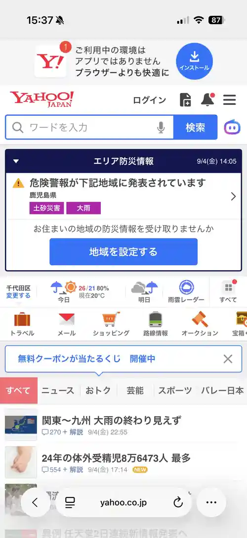
In my iPhone captures, Yahoo Japan exposes a remarkable amount before I have meaningfully scrolled. There is web search, an emergency-warning module, a region selector, today’s weather, tomorrow’s weather, precipitation probability, current temperature, a rain radar shortcut, links to Travel, Mail, Shopping, transit information and Auctions, news-category tabs, and multiple headlines.
The Yahoo US capture gives me search, sign-in, one dominant news card, and the beginning of a personalized article feed.
This table is only about what is visible in these captures. Yahoo US has weather, sports, finance and other services elsewhere in its product, and Yahoo’s own homepage documentation says the homepage can surface weather, stocks and sports scores. The point is what each design chooses to spend the first screen on.
| Visible in the mobile capture | Yahoo Japan | Yahoo US |
|---|---|---|
| Web search | Yes | Yes |
| Emergency/disaster information | Prominent | Not visible |
| Local weather today | Visible | Not visible |
| Tomorrow’s weather | Visible | Not visible |
| Rain radar | Visible | Not visible |
| Region controls | Visible | Not visible |
| Mail shortcut | Visible | Not visible |
| Shopping shortcut | Visible | Not visible |
| Transit shortcut | Visible | Not visible |
| Auctions shortcut | Visible | Not visible |
| News-category switching | Visible | Not visible |
| Dominant news story | No single story dominates | Yes |
| Personalized article feed | Secondary | Central |
Yahoo Japan also has more to expose. LY Corporation’s current service directory lists Yahoo News, Finance, real estate, Sportsnavi, real-time search, Shopping, Auctions, a flea-market service, Travel, transit information, car navigation, Maps, disaster alerts, Weather, Mail, insurance, Q&A and more. The older Yahoo Japan service index makes the same breadth even more explicit, grouping services into entertainment, news, shopping, maps and transport, finance, travel and other categories.
The American Yahoo ecosystem is not tiny. Its current homepage help lists Mail, Finance, News, Search, Shopping, Sports, Weather and Games. But the mobile homepage I opened does not try to make the ecosystem legible at once. It mostly makes the feed legible.

That is the part of the Japanese design I think the usual “outdated” critique misses. The page is not merely dense. It has a different allocation strategy for scarce screen space.
Information density is not the same as visual complexity
There is good evidence that visual complexity can hurt usability.
In a CHI 2020 study of 165 participants, Amanda Baughan and colleagues found that increasing website visual complexity reduced search efficiency and information recall. An earlier 2009 study by Alexandre Tuch and colleagues found that more visually complex website screenshots produced slower visual-search responses and worse later recognition, along with less positive subjective responses.
There is also evidence that people form aesthetic judgments extremely quickly. In Tuch et al.’s 2012 experiments, low-complexity, prototypical sites were rated more attractive, with effects appearing after exposures as short as 17 milliseconds.
If the claim is “reduce competing decoration and make hierarchy easier to parse,” the research is friendly to modern Western design.
But hiding useful alternatives is a different intervention.
A 2004 experiment on web navigation in cellular phones compared broad, shallow navigation with narrower, deeper navigation. The broader structure performed better on both the small-screen phone interface and desktop control. A 2010 small-screen study found an even more interesting tradeoff: forty older participants navigated best when the interface combined a large font with a large preview of available functions. The worst condition had the large, readable font but showed only one function at a time. The authors’ conclusion was that orientation could matter more than simply reducing visual density.
That maps surprisingly well onto the two Yahoo pages. Yahoo Japan lets me compare alternatives without opening a menu. Yahoo US gives each item more room, but makes more of the information architecture latent.
The design lesson is not “more stuff is better.” It is that cleaner can mean better organization rather than less information.
Japan does not get a scientific exemption from clutter
The cultural explanation also needs a check.
A CHI 2021 experiment tested 65 Japanese and 84 American participants on website-search tasks. It did not find that Japanese participants were magically better at processing dense pages. Japanese participants took longer to find information overall, and greater website complexity made the difference larger.
A separate 2020 comparison of nine companies’ Japanese and US sites found more heuristic usability violations on the Japanese versions, especially violations of the “aesthetic and minimalist design” heuristic. That study used expert heuristic evaluation rather than real user tasks, so I would not treat it as a ranking of the two countries’ web design. It is still useful evidence against the lazy idea that Japanese density is automatically more usable because Japanese users are accustomed to it.
There is production evidence pointing the other way. In a 2025 Japan Times investigation into Japanese web design, growth consultant Shoin Wolfe described tests on LIFULL HOME’S in which cleaner pages with more negative space and less rarely used information produced lower engagement and fewer conversions, so the team reverted. That is a reported company test, not a published controlled experiment, and Wolfe himself offered alternative explanations such as familiarity with the existing interface.
So the evidence is annoyingly sensible. Visual clutter can make people slower. Showing more of the system can make navigation easier. Familiarity and local expectations can change what performs well. There is no result that says “Japanese web design is better,” and no result that says Western minimalism is universally better either.
The “Japan is stuck” story is only partly supported
The organizational explanation in the short is plausible, but it gets too strong if it is treated as the explanation for the interface.
Japan really does have a documented multilayered software-subcontracting structure. A RIETI study using Japanese software-industry data grouped firms into independent, prime, intermediate and final contractors and found higher total-factor productivity among independent software companies than among the multilayered contractor groups.
That establishes something about the industry’s organization and productivity. It does not establish that subcontracting caused Yahoo Japan’s information density.
The Japan Times reporting provides a more direct, but still interview-based, mechanism. Designers described large companies as reluctant to remove old features because removal creates visible failure risk while adding another thing is politically safer. That can absolutely produce clutter. The same article also documents genuinely bad practices such as baking text into images, which hurts responsiveness, selection, indexing and screen-reader accessibility.
Those problems can coexist with an information architecture that is useful. “Old-looking” is not a sufficient diagnosis.
The funny part is that Yahoo US is rediscovering the portal
In March 2026, Yahoo introduced MyScout, a customizable homepage inside Yahoo Scout. Yahoo says users can assemble tiles for inbox snapshots, stocks, weather, sports scores, shopping comparisons, games and other topics into one at-a-glance view.
That product direction is almost a synthesis of the two philosophies: Yahoo Japan’s dashboard breadth, but personalized and rearrangeable instead of fixed.
So my current answer is narrower than “Japanese web design is better.”
For a news feed, I prefer the American hierarchy. One story gets room to breathe, the page is easier to parse, and the research on visual complexity explains why that feels good immediately.
For a homepage, I prefer Yahoo Japan. Weather, disaster status, transit, mail, shopping and news are all things I might plausibly want when I open a general-purpose portal. Making me discover them through menus or separate products does not make the underlying system simpler. It makes the first screen emptier.
The version I would actually want is Yahoo Japan’s information architecture with a calmer visual hierarchy: keep the broad, shallow navigation and the useful local modules, reduce unnecessary decoration, group related functions more strongly, and preserve readable type and tap targets.
The Japanese page may look like the web forgot to move on. The American page makes me wonder whether moving on also meant forgetting what a portal was good at.
Sources
- Yahoo Japan services, LY Corporation
- Yahoo Japan service index
- Yahoo homepage overview, Yahoo Help
- Yahoo introduces MyScout, March 2026
- Baughan et al., “Keep It Simple,” CHI 2020
- Tuch et al., “Visual complexity of websites,” 2009
- Tuch et al., “The role of visual complexity and prototypicality,” 2012
- Parush and Yuviler-Gavish, “Web navigation structures in cellular phones,” 2004
- Ziefle, “Information presentation in small screen devices,” 2010
- Baughan et al., cross-cultural website search study, CHI 2021
- Doi and Murata, US-Japan website usability comparison, 2020
- The Japan Times, “Why Japan’s internet looks weird unless you live here,” 2025
- RIETI, Japanese software industry’s multilayered subcontracting structure
- YouTube Short that prompted the comparison
Comments